I’m very excited to announce that Rise: Battle Lines is set to release on October 19 on Steam! Rise: Battle Lines has come a long way since the last time I posted about it here with improved gameplay, environment, UI and more great music and SFX. Please check out the Steam game page and the game trailer! Our game may be in early access but it’s ready to go and play and is in a proper late beta state. During early access, we are aiming to add extra features to what we already have and polish/improve things to give an…
Archmage Rises’ new logo
While Defiance Games was quite happy with the original logo I created for them of Archmage Rises, they eventually found that the logo didn’t have a “hardcore” enough feeling to it. We decided that the frame and using a slab-like typeface were the prime causes of the issue, so we took it in a new direction. I focused on simplicity and stylization of the text. The shattering and overpowering staff works as an underline while giving a hint of the theme of the game: will you become a powerful mage or fall apart on your journey?
Archmage Rises logo
Defiance Games approached me again to make a new logo for a new game. This game is called Archmage Rises, which is a throwback to the classic D&D style RPG games with modern random world simulation features. Since magic was a big part of the game, a main goal was to convey that through texture around the text and small features in the border. I provided a few different styles and he instantly loved the version that is most similar to what you see here.
Rise UI
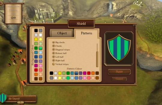
The Secret Games Company welcomed me into their team to help them create the UI for Rise: Battle Lines, a Unity 3D game that utilizes NGUI. I needed to create designs that worked with some of NGUI’s features, such as scalable panels using NGUI’s sliced sprite feature. They already had a basic UI in the works and needed me to complete it visually. After our programmer finished implementing the UI screens and functions, they tasked me to work on the UI in Unity, doing things like adding new features, fixing bugs or tweaking the design. It has been a great…
Storybook app icon
A few months ago, I worked with Mirthwerx to create this icon for their new storybook app. Mirthwerx created “A is for App” for parents in the tech industry that wanted to share a bit about their work to their children while reading the book. The icon communicates that idea by having the ABC letters pop out of a tablet device, but it still keeps the child theme that their book targets. I found making the border of the icon a tablet device really helped bring everything together without it looking cluttered or loosing focus. Check out their app landing…
Inventory UI
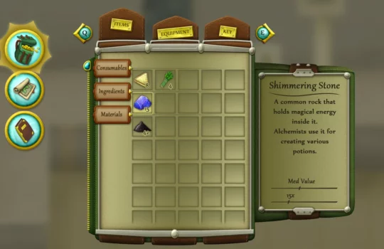
This is an inventory UI concept that I based on one of my own games I work part time on. My goal for it visually was to make it have a backpack look to convey the feeling that you are searching for items in your own backpack. The visual theme also sparked ideas for the belt tabs and the zipper scrollbar. I also decided to make everything that is clickable have traces of gold and teal in their color scheme. This would help give guides for navigation, which combats the issue of a lot of detail potentially being distracting. I…
RPG Town logo
I worked with Defiance Games to create this awesome logo of their upcoming game, RPG Town. My role was to create the basic concept and then their amazing artist painted the letters. I then painted the background to finish the logo. Their game also sounds very ambitious and interesting and the logo reflects this with all the variety of details found in each letter.
Steampunk map screen
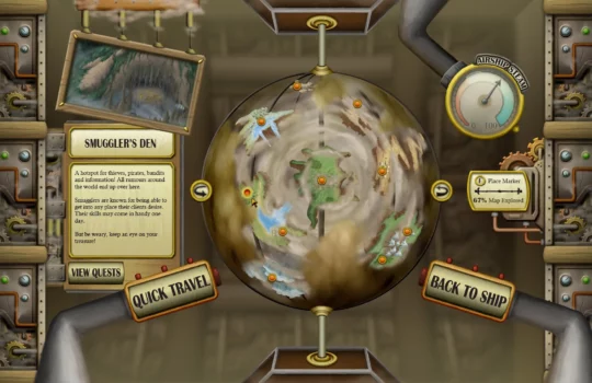
I created a steam punk style map screen concept that would work for PC controls. My goal was to make a design that works with 1280×720 to 1920×1080 size screens and use repeating techniques to keep the image size down. My solution was making the smaller screen show all the necessary content and the larger version adds extra details and spaces things out a bit more. I also wanted to give the UI a hand painted feel, so I often repainted over the main shapes and shadow effects to blend everything. The player would encounter this screen while on their…
Zombie social game UI
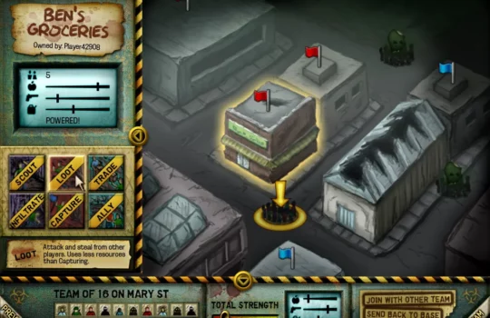
I designed a UI that would work for a zombie strategy game on social media like Facebook. The game mechanics would be similar to Rebuild 2 and have new features like multiplayer and capturing other player’s buildings by controlling small teams of units. I separated the UI in two main windows, the left shows up whenever you click on a building or enemies and the bottom shows up when you click on a team. This allowed a large amount of specific orders that the player could do. For example when you click on an occupied building, it gives you options…
iPhone RPG item shop UI
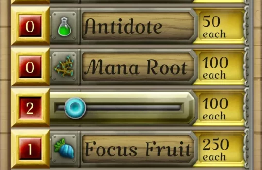
This is a mock UI for a fantasy RPG style game on the iPhone 5. My goal for this exercise was to give a convenient way for the player to buy large quantities of supplies with various item choices using the touch controls. The solution I came up with was to touch on the left red squares to make a slider pop out and then drag it left and right to increase the quantity. The player can also easily scroll through the item list by dragging up and down, and the slider on the right shows the list position. After…
Sci-Fi ARPG UI
I created a science fiction user interface for an ARPG style game. My focus for this one was applying the detailing and shading that I experimented with while recreating the Starcraft 2 and League of Legends UI.
UI exercise
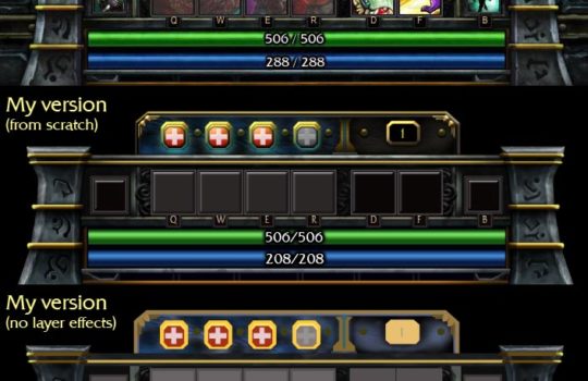
I’ve done an experiment to analyze AAA UIs and how they were made by recreating them from scratch in Photoshop. Most of the techniques used were shapes and layer effects, then a bit of painting and texturing over top. I don’t know for sure if the original user interfaces were built the same way, but this was quite a rewarding exercise anyways as it has pushed me to think of UI a bit differently and the challenge really unlocked some new abilities for me.