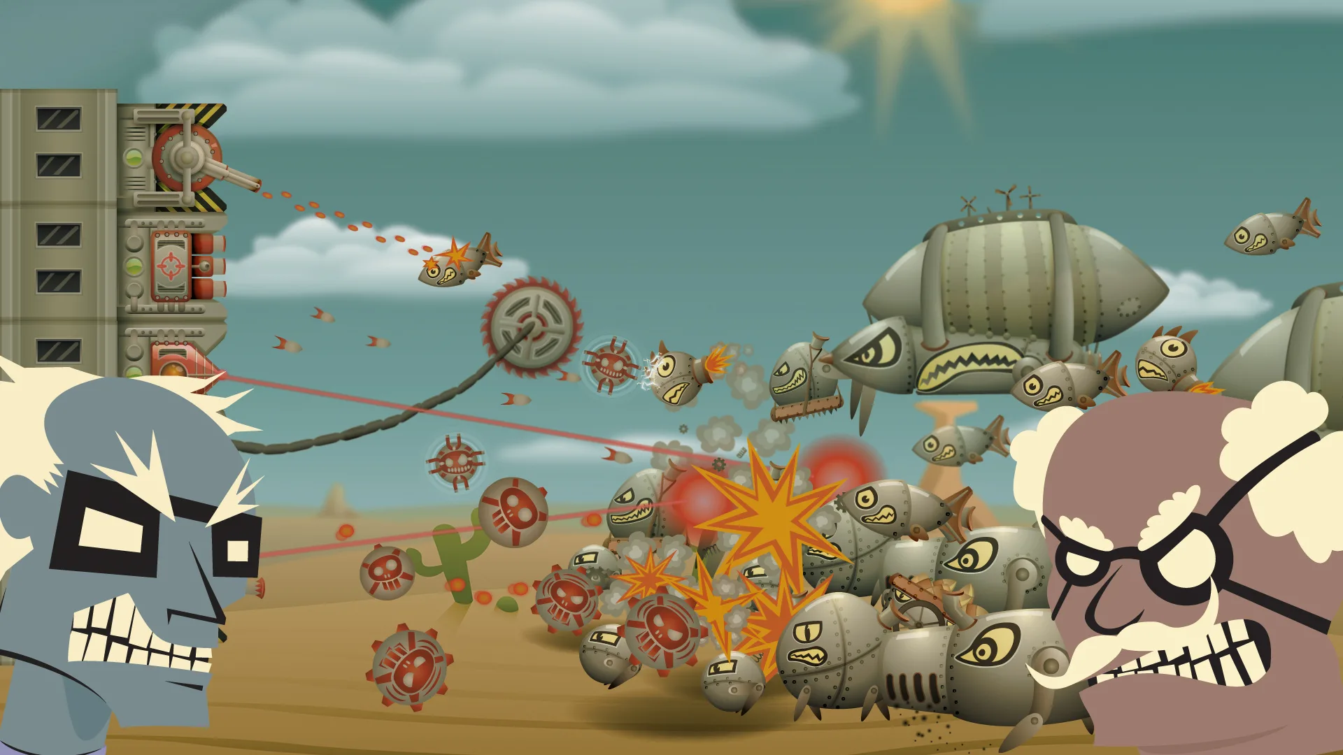
Rocket Defense Darryl Spratt identityArchmage Rises Designing an iPad tower brawl game.Rocket Defense is a tower “brawl” game where you take the role of a mad scientist who wants to build the most advanced science facility for his experiments. His nemesis, another mad scientist wants no competition, so he sent out his robotic bombs and rockets to destroy your tower. It’s your job to use turrets, bombs, missile launchers, lasers or any other weapon to defend your tower from his attacks and complete your tower. I collaborated with Dark Acre to create the game, however development ended in 2012.The player has to navigate the turret to attack as a wave of ground and air units head towards the tower.Features:Varied weapon controls fit for the iPad. The three weapon classes each provide a different style of touch controls and play style, which challenge you to find best strategy against your various foes.Unlock, upgrade and customize. Choose the weapons you want to unlock and attach them to your tower, discover your favorite tower build as you try all the weapons.Survival mode and story mode. Fight for the high score on the leader boards in survival mode or try to build facilities around the globe and take over the world in story mode.RolesGame DesignUser Interface Design2D Art & AnimationEngineUnity 3DTeam Size2The map in story mode, the player controls the scientist and takes over the red control points.A concept of the arctic environment the player would reach in story mode.UI DesignVisual StyleThe style of the UI was based off of old radios and audio consoles to give the game a retro technology look. The overall clean and cartoony design is meant to help attract casual audiences on the iPad and matches the style of the player’s tower while contrasting the steam punk look of the enemies.The Upgrade screen. The player can drag any unlocked weapon onto the tower squares.Upgrade ScreenI needed to convey a lot of information to the player on the upgrade screen while preventing the player from getting confused or overwhelmed, instead making it simple and inviting to a casual audience. The solution was to organize the UI in three pieces to distinguish the different type of information and what each section does for the player.The Weapon Bar at the top holds the weapon functions like unlocking new weapons or dragging them onto the tower. Tapping the weapon squares give more info, such as the weapon notes, serving as a tip on the weapon’s play style or the graphs on the speed and damage.The radio like Stat Panel at the lower right is like a main menu and tracks the player’s economy. The atom icon is the main currency in the game that unlocks new upgrades. The bricks represent materials, which are a refundable currency that drains as the player drags weapons on/off the tower. Finally is the menu buttons, I used symbols where possible to make localization easier.The Tower Upgrades section at the lower left is used to unlock more floors for the tower. It shows the cost to upgrade, what requirements the player has to meet and the materials the player will earn.The main menu is meant to look inviting and interactive by using real world objects.The pop-up panel being used as a pause function. The button panel at the bottom can be removed as needed.Main MenuThe main menu uses a grid format with large buttons to tap on to give best controls for touch interface. It introduces the retro cartoony style of the game by using old TVs and cupboard doors as part of the UI. The “Story!” and “Survivor!” text gives a look of a black and white B movies. The closed cupboard doors create mystery of what’s behind them, and we could easily replace the doors with a new button for a newly introduced feature later in development.Pop-upThe game uses the pop-up screen for content like pause, options or any Yes/No questions. The design is dynamic to fit those needs, so we can remove the bottom button panel, shrink the overall size vertically or resize and change the buttons with text.A teaser image for a higher level blimp enemy.Art & AnimationIt was my first time creating sprite animations for a game and it was quite a learning experience for me at the time. My general goal for the art was to make the enemies contrast the tower’s visual style, so that the contrast between the two styles make it easier to track what object is an enemy and what is an ally as the game could have a lot going on in later levels.Colour and ShapeThe murky-gray enemies give off a steam punk look with the rounded shapes, metal panels, smoke stacks, mechanical legs and bolts. The final and most important touch is the painted eyes and teeth on them which takes influence from the nose art on planes in WW2.In contrast, the player’s tower is very clean and square with a retro-modern look that has minimal unnecessary additions, yet has more vibrant colours. This gives the main scientist a feel of being organized and functional, someone with a clever plan (to take over the world). I continued this with the main character’s look as he’s very square himself and walks stiffly.The gang of mad scientists and a scheming tycoon.All the weapons that can be unlocked and the enemies to the right, both having distinctive styles from each other. Back to top