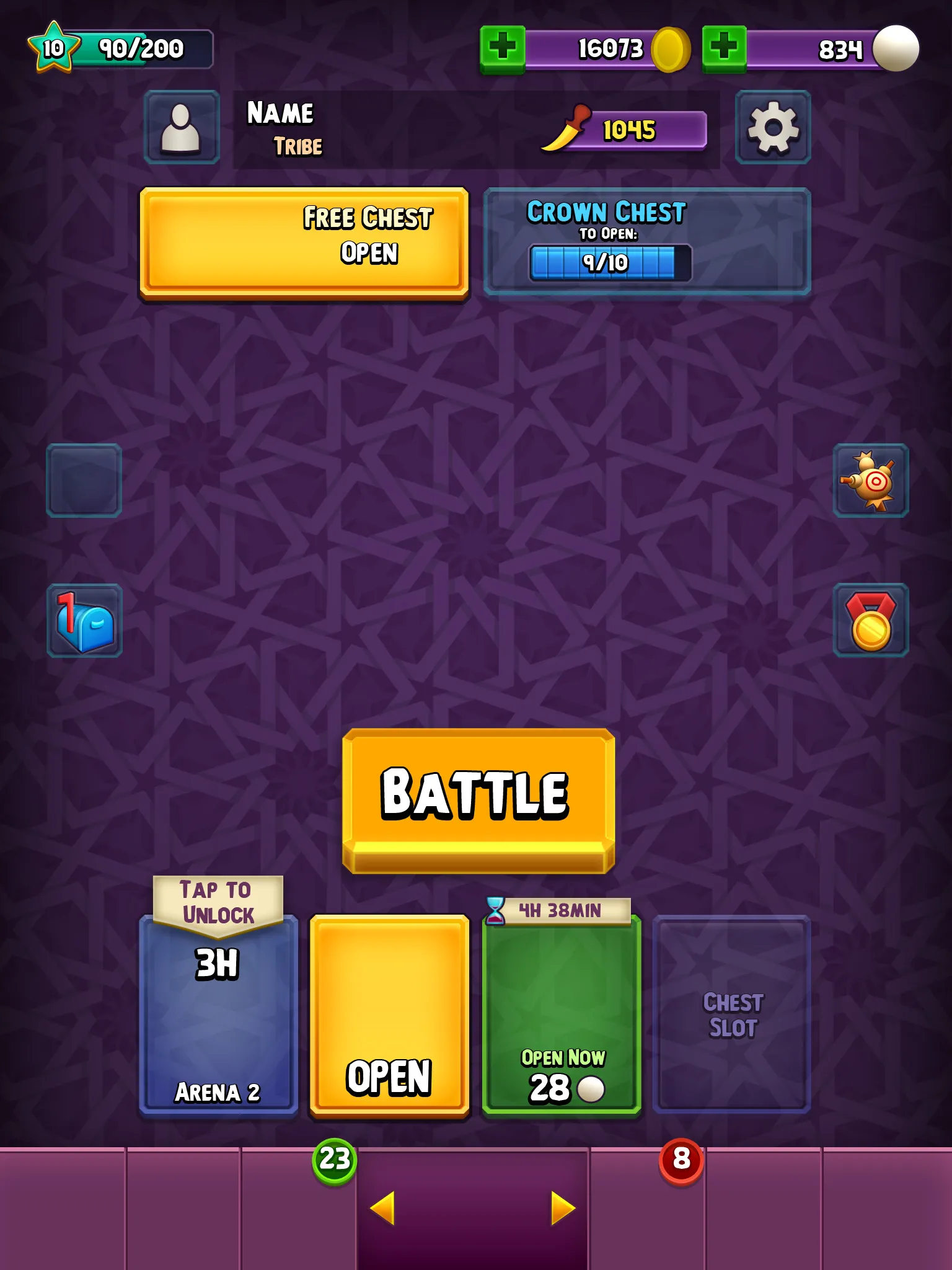
Tribal Mania Rise: Battle LinesSkyrim: Shimmerfall Springs Conceptualizing and creating over 250 individual UI assets for Tribal Mania.Lamba contracted me in 2016 to create all of the 2D UI art assets for their new mobile game, Tribal Mania. It was quite an extensive project with many different screens and pieces that needed to be created for the user interface and in-game HUD. All of the art was created using just vector shapes and layer styles in Photoshop to maintain a clean look while being easy to scale up.This was the first time where I worked with an Art Director to establish the visual style of the user interface, which was such a great experience, because his guidance pushed my talents beyond what I thought I was capable of at the time. Over the course of about 8 weeks, I worked with them from conceptualizing UI Art to delivering over 250 individual retina ready images for implementation.Roles2D UI art creationToolsPhotoshopIllustratorTapratsClientLamba, IncTeam Size25+Lamba already had all of the layout and screens determined before my work started, so my job was purely focused on creating the assets and establishing the style. I created modal panels, icons, buttons, banners, borders and backgrounds. Many of the assets had to be easily scalable to fit different content sizes.My previous work on Rise: Battle Lines came in handy during this project because I learned about the requirements for retina displays and how to manage up-scaling and exporting the larger versions with no change in the visuals. A challenge in this process is conceptualizing them in 1x pixel density and then having to upscale them (sometimes in multiple different ratios) without any change in the quality or layer styles. Foresight in preparation of this is the most helpful, such as using non-destructive and vector based art, but I’ve also developed scripts in Photoshop to help automate this process and reduce human error.We started out by determining the style and colours of the main panels and eventually settled on a look primarily of purple hues with complementary yellow highlights and a style that utilizes hard, clean edges to stand out against the worn out buildings in the background. The purple colour is also a fresh contrast to the sandy browns that are seen in matches. What stands out most to me is the sharp buttons that give an appearance to cut gems, which importantly makes the buttons attractive to click on.My first concept blended into the background too easily.The second stood out more, but the purple was too bland.Third was close but details needed to be further simplified.A screen of the final UI style that keeps a much more clean, uniform and simplified look. Back to top