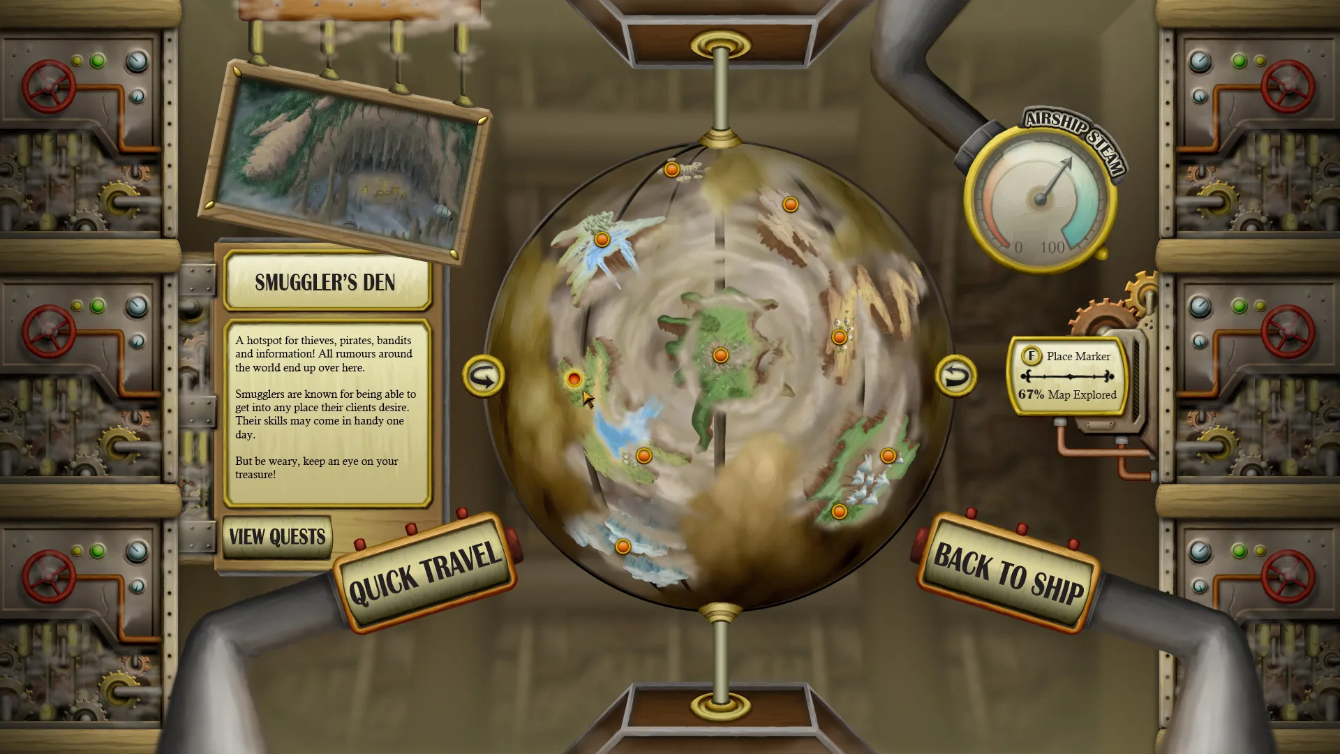
UI Mock-ups Mystic RavineRamatron Designing a range of user interfaces that solve different issues.During late 2012 to 2013, I wanted to learn more about the creation of more detailed game user interfaces, so I chose to create these mock-ups to hone those skills. As an extra challenge—and to improve not only my art skills but also design skills—I came up with challenges in the requirements for the design and then had to find solutions in the design to achieve those goals.I used a process of creating the vector shapes in Photoshop or Illustrator and then using layer styles to add lighting and shading. Finally any textures were added in if the UI needed them.Item shop UIThe first UI was an item shop for a phone interface. I went with an RPG theme and put a lot of character into the elements to give a feeling of a countertop that contains all the items you are shopping for.The challenge was to design an intuitive way to buy different quantities while utilizing the touch interface. My solution was to make a slider appear when you select the left quantity button and then you can tune the quantity as needed.RolesUser Interface DesignTeam SizeSoloSocial strategy UII then designed a social strategy game UI and the challenge for this one was to redesign the UI for an existing game sort of like a sequel to the game. I came across Rebuild 2 at the time and thought a more gritty UI would suit the theme of the game quite well and the zombie theme would be fun to work with. I re-organized how some of the game’s data is presented with the aim to make the gameplay a more user friendly experience.Map hub UINext I created a UI for a map hub intended for PC and the design challenge was to make the UI work with different screen sizes. I intended for this design to be part of a first person game so I thought it would be interesting to make the UI immersive and part of the game world. You can see my ideas for that in the handle bars with buttons or the globe made out of wires.My solution for the different screen sizes was to make the important items slightly move towards the center and the less important edges to be just filled with detailed objects. The design of the handle bar buttons was useful for shifting the UI around as it looks completely natural in both screens.Inventory UIThe final UI was for an inventory that would be for a game that I was personally working on at the time. My challenge for this one was to make an inventory intuitive for both controller and mouse/keyboard and to create a useful sorting system. I also wanted the UI to give a feeling of opening a backpack, since the main character in this game was an explorer who always carried a backpack of goodies.The sorting solution I came up with was to have these tabs on the left of the item grid that the player can navigate to and going up and down between them would let you skip the section that the tab manages and go to the next section. This would be more useful as the inventory gets heavily populated with items and is meant to further sort items of the same class as you can see the tabs at the top manage more different items and are switched with Q/E or the bumpers on a controller. Back to top