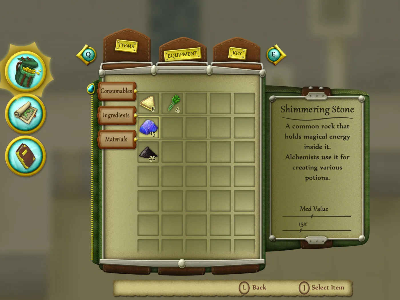
This is an inventory UI concept that I based on one of my own games I work part time on. My goal for it visually was to make it have a backpack look to convey the feeling that you are searching for items in your own backpack. The visual theme also sparked ideas for the belt tabs and the zipper scrollbar.
I also decided to make everything that is clickable have traces of gold and teal in their color scheme. This would help give guides for navigation, which combats the issue of a lot of detail potentially being distracting.
I find navigating in inventories with many items gets tedious if you need to scroll down far. A solution I thought for this was to make tabs that the player can select and skip to the next category, instead of scrolling through all the items. For example, the player could have the Consumables tab highlighted and then press down to go to the Ingredients tab. This feature will be more useful when there are more items in one category, making them take up multiple rows.