In this tutorial I go over how to create a stepper and its functionality in Unreal using UMG. It’s quite an extensive step-by-step that also introduces ideas on how to combine different UMG widgets to create more complex ones. Note that this tutorial focuses on building a functional prototype of a stepper in Unreal and does not cover creating the art for it.
What is a stepper?
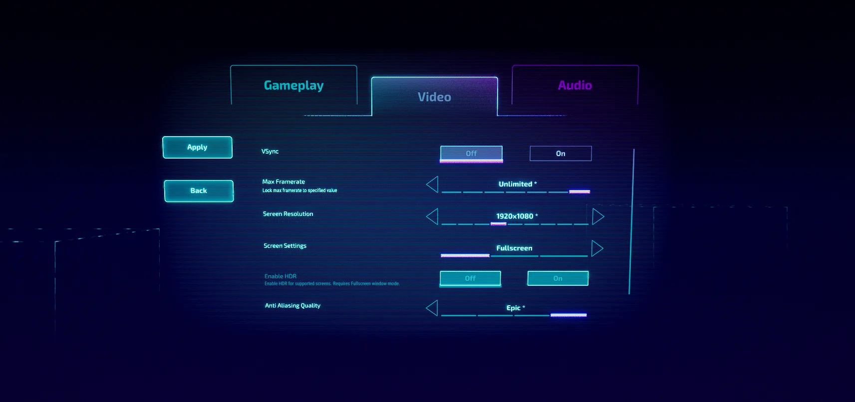
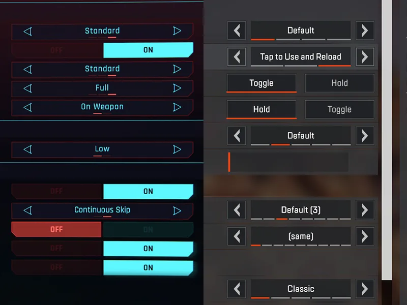
A stepper is used almost everywhere in games and web. It’s the text box with + and – buttons to change your seats at the movies, the upvote and downvote buttons on Reddit, and what’s used to swap through screen resolutions in a game.
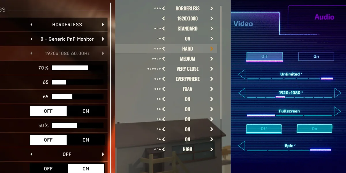
Steppers have become popular in console and multi-platform games because of the compatibility with both mouse and controller inputs. They offer a versatile solution, making it more economical to use a single widget that works for different input devices. The stepper is replacing the dropdown box on modern PC games for this reason, dropdowns are now only seldomly used in titles that heavily rely on mouse input, such as Age of Empires or Civilization.
When should a stepper be used?
While there are many uses for the stepper, it may not always be the most suitable choice.
You’ll want a slider when dealing with only numbers—especially with a large range of them. While a stepper is good for a small selection of numbers and great for a small selection of different values.
Ensure that the values in the stepper are descriptive of what they represent to make the most of its functionality. For example, instead of using a range of 1-5 for graphical quality, use steps like low, med, high, very high, and ultra.
Avoid making the stepper range too large, as it can become cumbersome for users to navigate through numerous steps. In such cases, consider a way to reduce the settings to 5 or use a slider to adjust the values. Alternatively, adding “step bars” to indicate the player’s position within the range can make dealing with larger ranges less overwhelming.
Steppers are particularly useful when the user’s selections are not numerical, such as when swapping through window modes. In these cases, drop-down boxes are the only other alternative if that choice is available.
Finally, if you are only dealing with two values that the user can swap between, the stepper may become redundant, and a checkbox could be better suited for this purpose. You can easily achieve this using the checkbox widget, or alternatively, repurpose two button widgets and disable the active one.
Building the stepper
Unreal comes with many widgets out of the box, but it doesn’t come with a built-in stepper widget. The reason for this is because the stepper is essentially a combination of multiple widgets. Let’s break that down and build it.
The stepper breakdown
We can split the stepper into 3 main pieces and 2 optional pieces:
- A button on the left and right to change the values
- A text label between the two buttons
- A text label for the stepper title
- Optional: step icons to track where you are in the list
- Optional: a text label that describes the function of the option
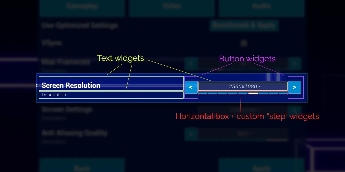
Construction in UMG
- Create a new blueprint widget with the
user widgetcommon class and call itStepper_WB. (right click in content browser > user interface > widget blueprint)
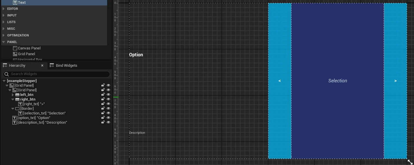
Setting up the grids
- In the widget designer, add a
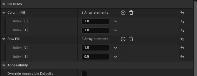
grid panel(from the widget palette on the left)- Create 2 columns with the first a value of 1.2 and the second of 1
- Create 2 rows with the top one a value of 1 and the bottom a value of 0.5
- Create another
grid panelas a child of the above grid panel- Create 3 columns with the first and last a value of 0.25 and the middle a value of 1
- Create 1 row with a value of 1 (it is important to have at least 1 row or column or else you might get some buggy layout)
- Place this grid panel in row 0 and column 1 with a row span of 2
- The child grid will be where all the stepper functions are and I’ll refer to it as the “stepper grid” while the parent gird will be called the “main grid”
The text labels
- Create a
text widget- Place it in row 0 and column 0 of the main grid
- Center align it vertically
- I call this label
option_txt
- Duplicate that text widget
- Put it in row 1
- make the typeface “light” and size 16
- I named this label
description_txt
Note
I tend to only name widgets that will be used as variables and leave the others alone. For widgets that I do name, I tend to use notation of widget_type to differentiate it from regular variables where I name like: myVariable.
The buttons
- Now in the stepper grid, create a
button widget- Place it in 0, 0 of the grid and style the visuals as you wish
- I call this button
left_btn
- Create a
text widgetas the button’s child- Set the text to “<”
- I used padding of 1.0, 1.0, 1.0, 3.0
- I call this label
left_txt
- Duplicate the button
- Place it in column 2
- Change its child label’s text to “>”
- I call this button
right_btnand the child labelright_txt
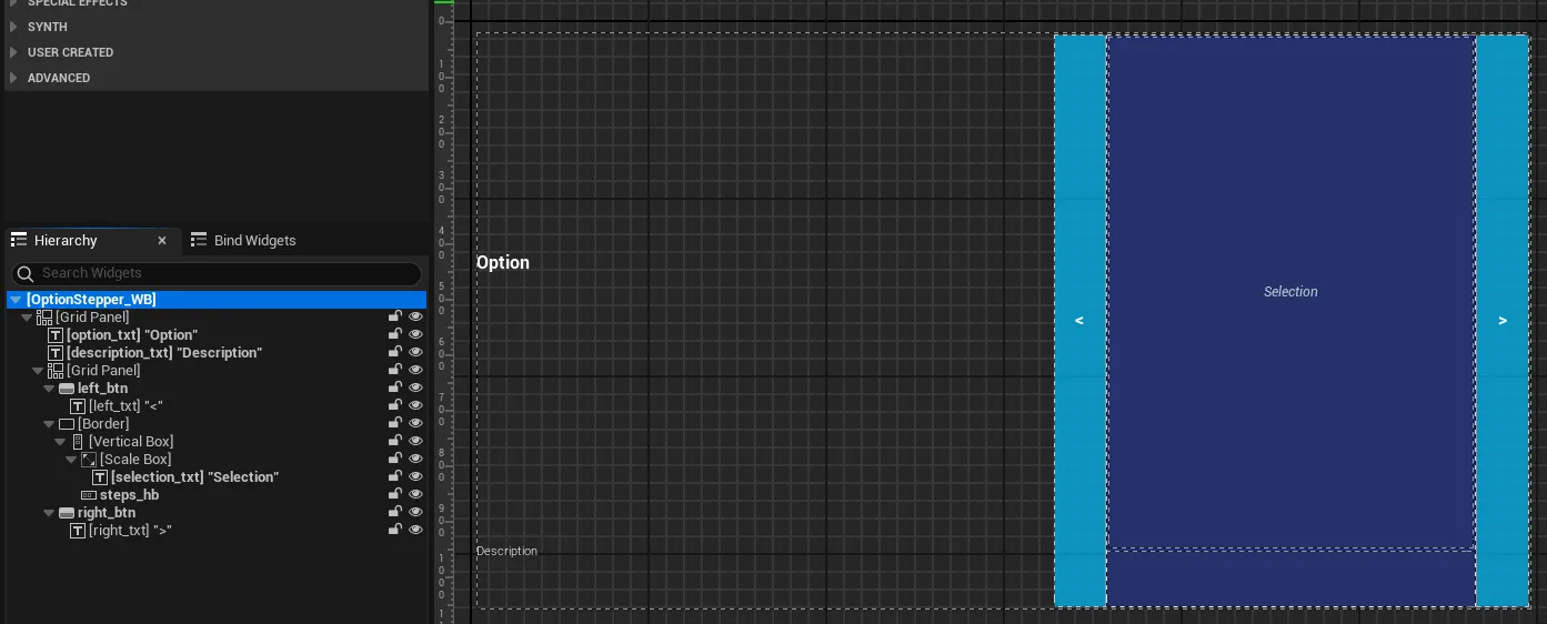
The “steps”
- Create a
border widget- Place it in column 1 of the stepper grid
- Set the brush color as you wish
- Create a
text widgetas a child of the border- Center align it vertically and horizontally
- Style as you like, I chose an italic font and a light blue color
- I named this label
selection_txt
If you do not want the “step bars” and just a label in-between the two buttons then you can skip steps 12-16.
- Un-child
selection_txtfrom the border so that we can child the next widget to it - Create a
vertical box widgetas the border’s child - Create a
scale box widgetas the vertical box’s child- Set the padding to 4
- Set the size to fill @ 0.9
- Set the stretch direction to Down Only (what this does is gets this widget and its children to hog 90% of the available space)
- Child
selection_txtto the scale box widget - Create a
horizontal scale boxas a child of the vertical box- Make sure this box is below the scale box in the Hierarchy
- Set the size to fill @ 0.1
- I call this widget
steps_hb - This widget will contain all the step bars that we will generate with blueprint and it will conveniently scale them down as more are added
Tip
The size fill of the two children of the vertical box will determine the thickness of each. If you want thinner “step bars” below the text label then you could set its fill lower to something like 0.05 and increase the fill of the scale box that holds the label respectively.
- As the last step, in the top node of the hierarchy, change the padding to 10.00, 20.00
Step bar widget
If you plan to make the step bars, there’s one more final step:
- Make a widget for the step bars
- Create a new
user widgetblueprint and call itStep_WB - Create a
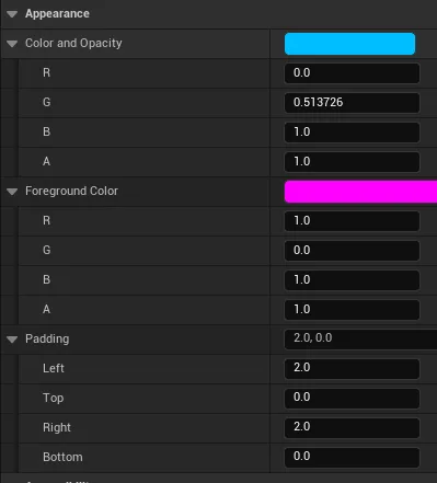
border widgetand call itstep_bdr - Keep all the colors of the border widget white
- Instead of coloring the border, we will change the color of the base in the hierarchy. So click the top node in the hierarchy and pick a color, I chose a sky blue
- Also change the left and right padding of the widget base to 2
- Create a new
Creating the stepper functionality
Now that we have our widgets constructed, we can add functionality to the stepper. I’ll cover various functions, including how to instantiate the stepper, generate the step bars, hide buttons when reaching a range end, notify what step is currently selected, and send information to the parent widget using the stepper.
Initializing the steppers in editor time vs run time
There are two main ways to handle the initial settings of the stepper. The first is using the PreConstruct event in the stepper to take the settings of the variables and update them live in the engine. The other is to not bother with setting the defaults in engine and get that data while the game runs by using the Construct event in blueprint.
I prefer the second approach because I need to access game user settings and I delete and recreate all the option widgets when they need to be refreshed to reuse the initialization code.
If your widget is static and won’t require refreshing based on selections in other widgets, you might consider using the first approach to have more control over visual styling. However, be cautious when using PreConstruct and don’t try to access any game data that isn’t available at editor time to avoid potential engine crashes.
This guide will primarily focus on the second approach, as it is the method I tend to use.
Initializing the stepper
Widget variables and events
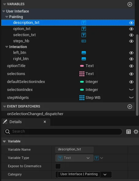
- First, we need to make sure all the needed widgets are accessible in blueprint. So make
description_txt, option_txt, selection_txtandsteps_hbto be ticked asIs Variable- This is done by clicking on the widget and at the top of the details panel beside the name, and ticking the
Is variablecheck box. - Also make sure all the buttons are variables too, but they should be one already
- This is done by clicking on the widget and at the top of the details panel beside the name, and ticking the
- On both buttons scroll down to the bottom of the details panel and click the + for
On Clickedevent. This will make a new event in blueprint. - For better organization I like to categorize the widgets
- Go to the blueprint view and click on the button and text widget variables
- For the texts and
steps_hb, set the category to “User Interface | Painting” - For the buttons, set the category to “User Interface | Interaction”
Blueprint variables
- Create a new variable called
optionTitle- Make it type
Text - Tick
Instance editableandexpose on spawn. This will allow us to initialize it’s setting upon making this widget.
- The default value could be set to “Option”
- Make it type
- Duplicate
optionTitleand call itdescription- The default value could be set to “Description”
- Duplicate
optionTitleand call itselections- Make this an array
- The default value could be set to “Selection”
- Create an
intcalleddefaultSelecitonIndex- Also tick
Instance editableandexpose on spawn
- Also tick
- Create another
intcalledselectionIndexand make itprivate
Construction script
Now we need to make the main construction script in blueprint.
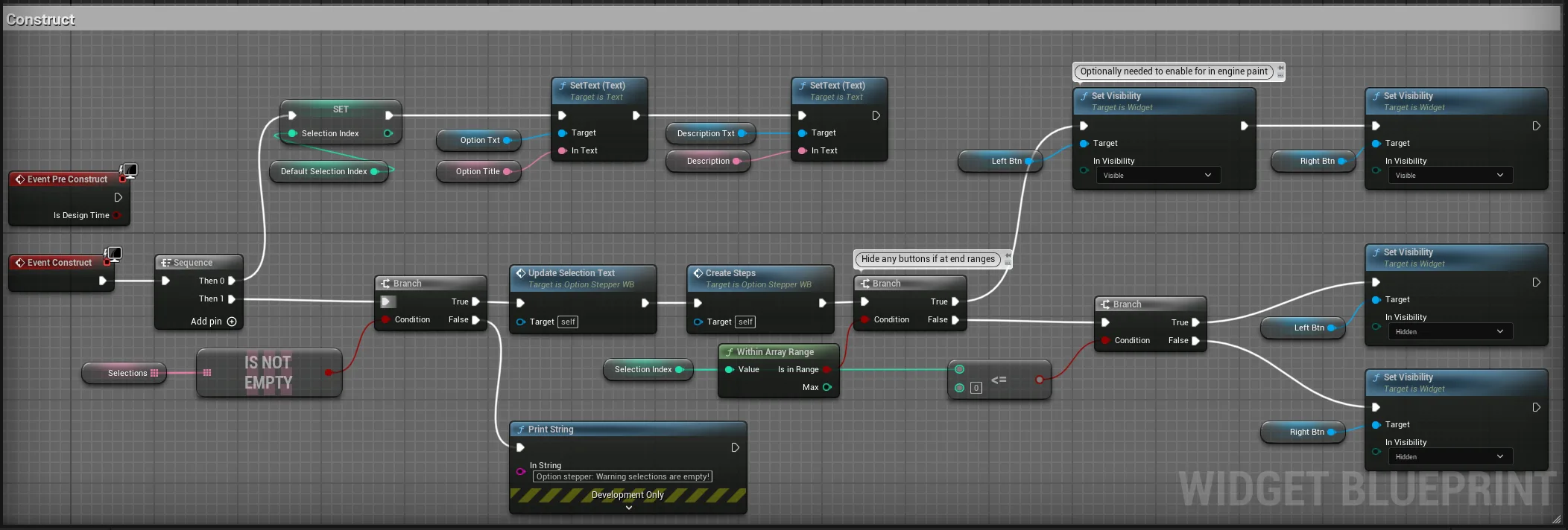
Here’s a run down of what the script is doing:
- The first sequence is setting all the text labels and the default selection that is picked when instantiating this widget
- The next sequence makes sure that there’s at least one selection, then will call my custom functions that update the selection text based on the index and create the step bars
- Finally, it will hide or unhide the left and right buttons if you are at the edge of a range. This is a personal design choice of mine as I want feedback to the player that they reached the end of the range by hiding the button. As art is added, this could be changed to a disabled version of the button art.
- The optional nodes are if you are using the
PreConstructevent, you will have to consider enabling buttons as the range is changed. Also you would plug in the other event node there.
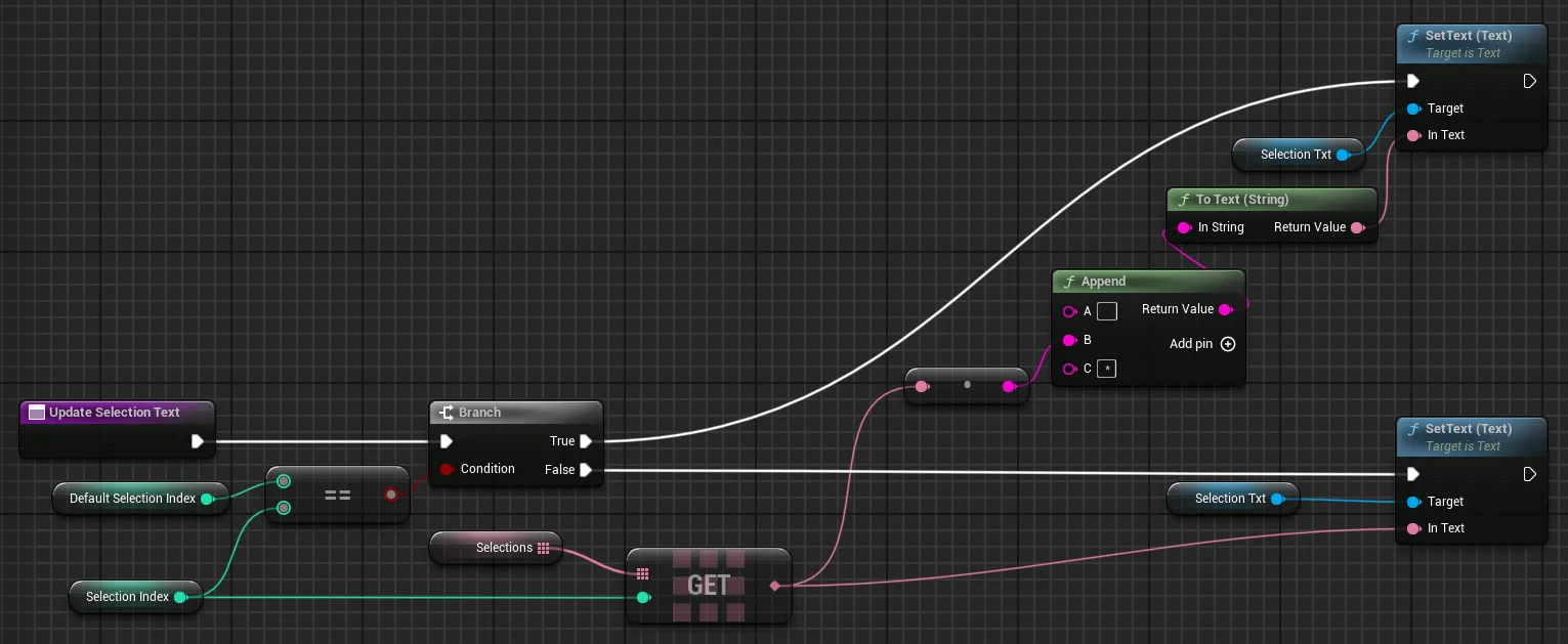
- Build the
UpdateSelectionTextfunction as the above image if you want this feature, then build the rest of the construction blueprint- All this function does is add two spaces in front and a space and an * after the selection text to signify that this is the value that is currently applied to the game. You can customize this function as you see fit (bold the text, change the color etc.) or not bother with it.
- We can ignore the function
CreateStepsfor now
Event dispatchers
- Create a new event called
onSelectionChanged_dispatcher - Add a
text inputcalled “selection” and anint inputcalled “index”
Creating the widget
Option A: Using blueprint nodes
- Go in your own options menu widget (this guide wont cover creating an options menu)
- Use the
Create Widgetnode and select theStepper_WBclass
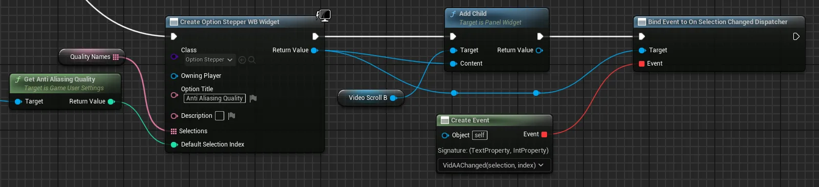
- With the new input values on the node:
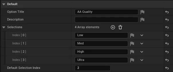
- Choose an option title, in the image I’m using “AA Quality” and choose a description if needed
- Create an
arraythat contains all of the quality names. I reused this array for multiple different quality settings - The
Get AA qualitynode is from theGet Game User Settingsnode
- I add it as a child to a scroll box widget using the
Add Childnode - I finally bind the event listener we created earlier to a custom event in my options menu using the
Create Eventnode
So, you can see in this function that the AA quality from the game user settings will then set the default index that the selection starts out at and the label names will update accordingly.
Option B: Placing it manually in the menu
I mentioned earlier about this alternate way that I don’t prefer because of the limitations:
- Drag
Stepper_WBinto your options menu - Click on the widget and note all of the variables in the “Default” section, these are the ones we created
- Set the variables to what you want, see the above image for some comparable settings I made to option A
- Add a
Selection Changed Dispatcherlistener by clicking the + sign at the bottom - Now you would need to use blueprint get the
game user settingsor any other game data and set the default selection of the widget at runtime
The main advantage of this method I see is if you have many different widgets that use completely unrelated selection values, then you might want to set those values here rather than making an array of the values in blueprint.
A major disadvantage is if your widgets affect the settings of other widgets, then you need to add additional code to store that widget and control it. While with option a, all my code can initialize the widget, so then I can just delete them all and then create them again to update them.
Optional: Initializing the step bars
- Go back into
Step_WB - Create two
linear colorvariables- Make both
instance editableandexposed on spawn - Call one
defualtColorand the otherhighlightColor - Set the default color values as desired. I used a white for the highlight and a transparent blue for the default
- Make both
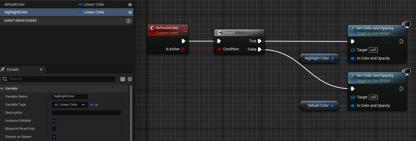
- Build the
RefreshColorevent as shown in the above image - Go back in
Stepper_WB - Create a variable called
stepWidgetsthat is anarrayofStep_WB
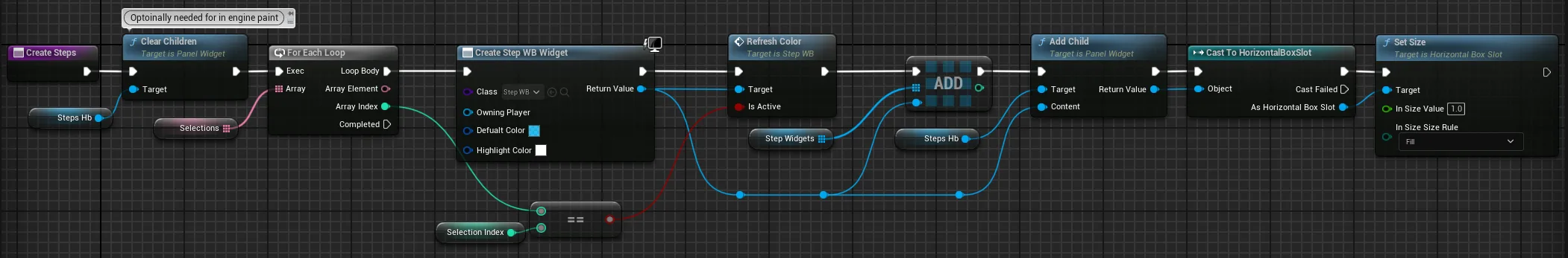
- Create a function called
CreateStepsand build as the image shows.- This is basically looping through the selections array and creating new steps and initializing them with the
RefreshColornode - We then add it as a child to
steps_hb, which will automatically scale them up and down based on the quantity - Finally, we use the return node of
AddChildto access the panel slot of the widget so that we can set the scale to 1. This is important as it would be a size of 0 otherwise. - The
ClearChildrennode is unnecessary if you aren’t initializing in engine
- This is basically looping through the selections array and creating new steps and initializing them with the
- Now go back into the event graph where the construction code is and add the
CreateStepsnode afterUpdateSelectionText, here’s the image of it again:
Handling stepper events
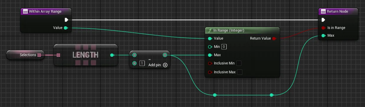
- In
Stepper_WB, create a function calledWithinArrayRangeand build as the image below shows. This just is a handy way to check if our selection is in range or not- Set the function to
Pureso that it doesn’t need execution
- Set the function to
- Go to the event graph for
Stepper_WBand find theclick eventsthat should be already created
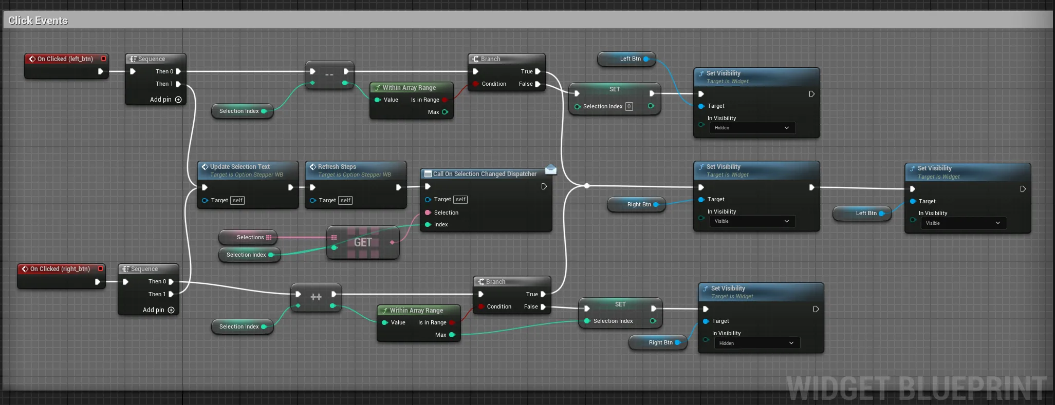
- Build the
click eventsas shown in the above image. Here’s what’s happening:- First, we add or subtract
selectionbased on the button that’s clicked and clamp the values to the array range - The button is then hidden if it has reached the end of the selection range, if not, both are visible
- Finally in the next sequence, we update the selection text and call the dispatcher
- If you are making the step bars, follow the next section and add the
RefreshStepsnode, if not you can ignore that function
- First, we add or subtract
Optional: Refreshing the step bars
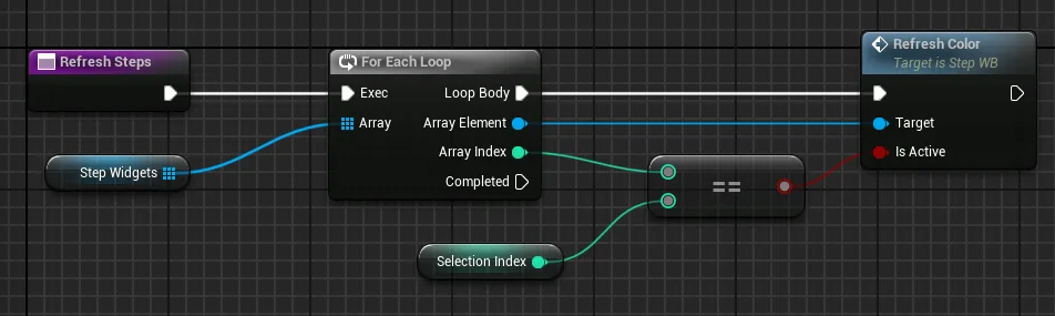
- Create a function called
RefreshStepsand build as the image shows. All this does is loop through all the steps in the array and then calls theRefreshColorfunction in each step to set the color
We should be done now!
Some final ideas
I’ve also used a couple interfaces to help manage applying settings in my widgets or removing them.
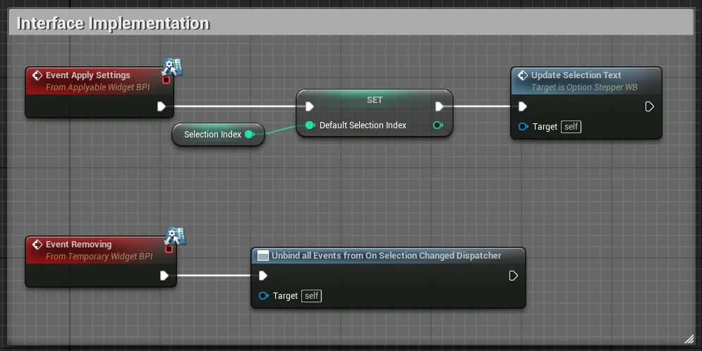
When the apply button in my options screen is clicked, it calls the event via the applyable widget interface. Then this interface implementation in my stepper updates the selection text so that the * is changed to reflect the new selection.
I also unbind all my events when deleting the widget to make sure that the garbage cleanup can do its job. Using an interface for this has made it much cleaner to unbind everything.
Concluding
With that, this tutorial comes to an end. I hope you found it helpful and have learned some new tricks, please check out some other tutorials that I have written if you’d like to see more by me.
If you ever need some help to build a UI in Unreal like this or help with designing a UI, then please get in touch with me, I’d be happy to hear from you!