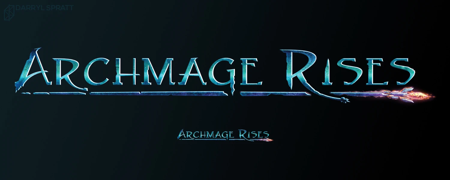
While Defiance Games was quite happy with the original logo I created for them of Archmage Rises, they eventually found that the logo didn’t have a “hardcore” enough feeling to it. We decided that the frame and using a slab-like typeface were the prime causes of the issue, so we took it in a new direction.
I focused on simplicity and stylization of the text. The shattering and overpowering staff works as an underline while giving a hint of the theme of the game: will you become a powerful mage or fall apart on your journey?

