It has been a while since I’ve updated my website, so I am quite exited to finally unveil my new logo and website. I’ve been itching to have my own logo for a while and designing for yourself is a challenging task. This has been something I’ve been slowly building upon overtime and have finally settled with a meaningful design that I’m proud of. With the new logo comes a site that pays homage to some features of my old one, such as the colours, but also brings in some much needed modern features, like supporting different media screens. I…
Logos
Posts regarding any logos or logo design work that I’ve worked on.
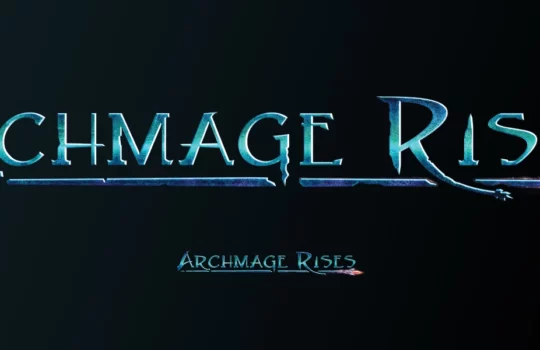
Archmage Rises’ new logo
While Defiance Games was quite happy with the original logo I created for them of Archmage Rises, they eventually found that the logo didn’t have a “hardcore” enough feeling to it. We decided that the frame and using a slab-like typeface were the prime causes of the issue, so we took it in a new direction. I focused on simplicity and stylization of the text. The shattering and overpowering staff works as an underline while giving a hint of the theme of the game: will you become a powerful mage or fall apart on your journey?
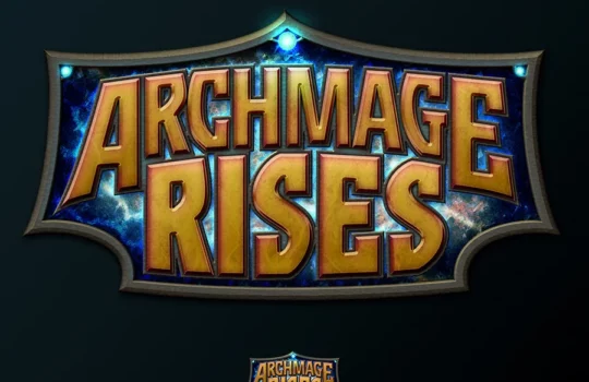
Archmage Rises logo
Defiance Games approached me again to make a new logo for a new game. This game is called Archmage Rises, which is a throwback to the classic D&D style RPG games with modern random world simulation features. Since magic was a big part of the game, a main goal was to convey that through texture around the text and small features in the border. I provided a few different styles and he instantly loved the version that is most similar to what you see here.
Storybook app icon
A few months ago, I worked with Mirthwerx to create this icon for their new storybook app. Mirthwerx created “A is for App” for parents in the tech industry that wanted to share a bit about their work to their children while reading the book. The icon communicates that idea by having the ABC letters pop out of a tablet device, but it still keeps the child theme that their book targets. I found making the border of the icon a tablet device really helped bring everything together without it looking cluttered or loosing focus. Check out their app landing…
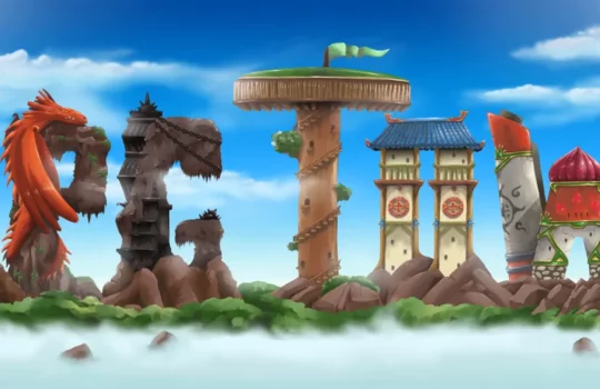
RPG Town logo
I worked with Defiance Games to create this awesome logo of their upcoming game, RPG Town. My role was to create the basic concept and then their amazing artist painted the letters. I then painted the background to finish the logo. Their game also sounds very ambitious and interesting and the logo reflects this with all the variety of details found in each letter.