It has been a while since I’ve updated my website, so I am quite exited to finally unveil my new logo and website. I’ve been itching to have my own logo for a while and designing for yourself is a challenging task. This has been something I’ve been slowly building upon overtime and have finally settled with a meaningful design that I’m proud of.
With the new logo comes a site that pays homage to some features of my old one, such as the colours, but also brings in some much needed modern features, like supporting different media screens. I also took the opportunity of building this site to learn WordPress theme development and PHP. I largely built this site from scratch based upon a bare-bones starter theme kit—and to be honest, I thought it would be simpler—but the process taught me lots of new things and gave me much more appreciation for web design and development.
In many ways, I found web design to be similar to game UI design and the coding challenges felt the same as the ones faced when building games, so I’m also reflecting on how I can apply these lessons to my game development career. This connection actually is how I came up with the slogan on my home page, “A compelling experience is universal.” The holistic approach to design where it considers all the wants and needs of the user or the player at the core is very similar in different fields, and I find that to be one of the most interesting things about design!
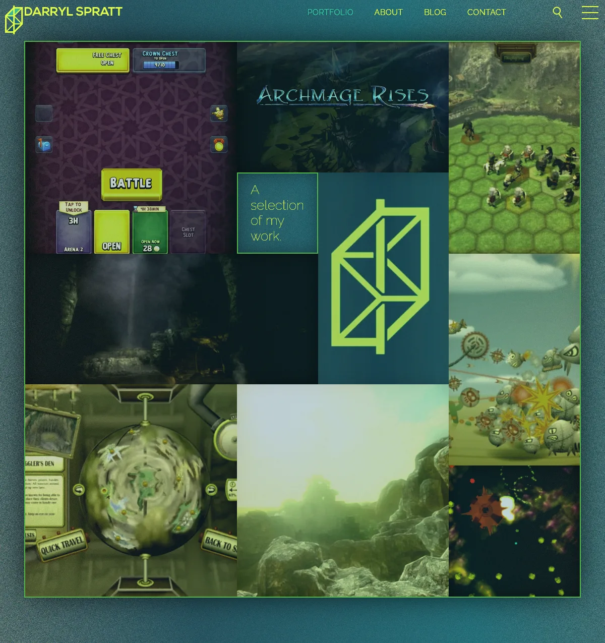
The portfolio page is a design that I’m quite fond of. I created a naturalistic looking grid using fibonacci ratios that spirals around a subdued heading while being framed by a green border and noise to evoke a gallery look. The result gives an eye catching glance of my work that feels playful while hovering around with the mouse.
One of the more challenging design issues was also a byproduct of one of my main design goals, which was to use vibrant colours, gradients and no white. White is much more effective at “matching” with the content than colours are, especially when compared to using gradients.
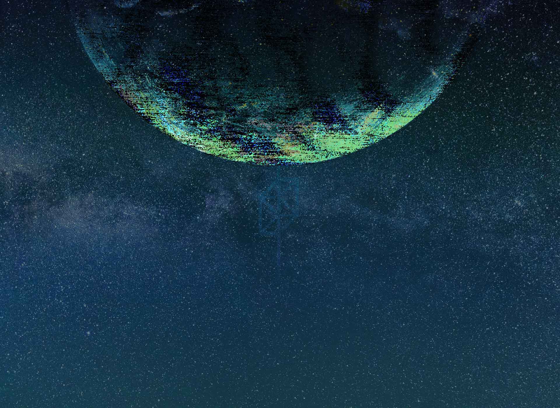
As a solution I used vibrant green borders as strong separators, noisy backgrounds to make other smoother images and backgrounds pop, and made the heading images stay in a green-teal-blue range. You can see the hue manipulation of the images in the portfolio page and more prominently in the headings of the individual portfolio piece pages where I animate changes in the hues (on computer only). This colour union causes these images to become “part of the website” and less as content pieces to highlight. I then have unfiltered images lower in the portfolio piece pages as the design shifts focus from navigation to the details and content.
I was taking a bit of a break from freelancing, but I’m now looking again for some freelance opportunities or work at a studio. If you have any inquires, please get in touch with me.